ClarityOS is Clarity's financial operating system for dermatology practices. I'd already spotted the reporting gap it fills and vibe-coded the proof-of-concept dashboard that won the engineering investment, so when we needed a teaser to launch it at AAD 2026, I knew exactly what the video had to argue. It's built to work without sound and to loop on the waitlist page it anchors.
The brief
The product fixes a specific frustration, so the video had to make you feel that frustration before it showed you the fix. Most practice owners have an EHR that runs the clinical side fine and tells them almost nothing about how the business is doing. Money comes in late, nobody can say exactly why, and the answers live in a biller's inbox or a spreadsheet. That gap is the entire reason ClarityOS exists, and it had to be the first thing a viewer felt.
Constraints were set by where it would play. Sound-optional, because conference floors are loud and most people watch muted. Built to loop. 4K. The story had to land for someone who joins it halfway through.
The story we told
I storyboarded it the way I work out any pitch, which is to reframe before I sell. I leaned on a couple of storytelling structures I keep coming back to: Andy Raskin's strategic-narrative arc, where you open in the buyer's world and hold the product back until you've earned it, and Nancy Duarte's rhythm of moving the viewer between what-is and what-could-be. None of that shows up on screen. It's the reason the cuts land where they do.
The hook concedes the thing everyone already believes, then breaks it. "Your EHR does everything." Beat. "Except tell you how your business is actually doing." The product doesn't arrive until Act 2.
From there it runs a rhythm of question and deflating answer, and the questions are the practice owner's own. "How much will I make?" Run a report. "Where's my money?" Ask your biller, who texts back that it depends on the payer and they need to look into each one. "A/R aging?" Open a spreadsheet. The frustration piles up until the screen is buried in warning cards, one for every plate a practice is spinning at once: claims, patient payments, credentialing, and on down the list. Then the villain line lands on the systems that promise to do it all: they call themselves all-in-one systems, but on the financial side there's still no single source of truth. A cursor with a face on it, the Figma-multiplayer presence bubble, draws the strikethrough live across "single source."
Hard cut to dark navy. Introducing ClarityOS. The financial operating system built for dermatology. The owner stays the hero the whole way through. The product enters here as the guide that gets them out of the old game.
The rest is a tour by persona. A pill switcher moves between Practice owner, Front desk, Back office, and Patient. The owner gets a monthly report that opens with a plain-English "This Month's Story." The front desk gets a check-in panel built like a game. The patient gets a clean mobile payment flow, white-labeled for the practice. Then the evidence: built by dermatology experts, with the word cycling through coders, providers, administrators, and a row of testimonial cards. Join the waitlist at os.clarityrcm.com, styled as one big search-bar button you want to click.
The craft move I'm proudest of is the color. Red-orange is the pain color through the whole first act, the warning triangles and the frustration. At the reveal it becomes the ClarityOS brand color, so the same color that marked the problem now marks the product. The background carries the emotional arc on its own, by temperature: warm gray in the what-is pain world, blush pink at the frustration peak, dark navy for the what-could-be reveal, sky blue once everything resolves into the new normal. The color does the emotional work before the copy says a word.
The craft
This was a collaboration, and I was in it the whole way. The brief I sent the animation studio wasn't a shot list. It was a thesis, the argument the video had to make and the order it had to make it in, and that was the start of the conversation, not the end of my part. They sent the storyboard on March 13, I marked it up frame by frame the same day, they had revised frames back by the 16th, and I was giving notes at every round after that, through the first draft on the 20th and the revised final I cut on the 29th after watching it run live. I owned the story, the structure, and the direction. They owned the animation craft, which they do better than I do. The best of it came out of the back-and-forth, with me in the room making the calls as each frame came together.
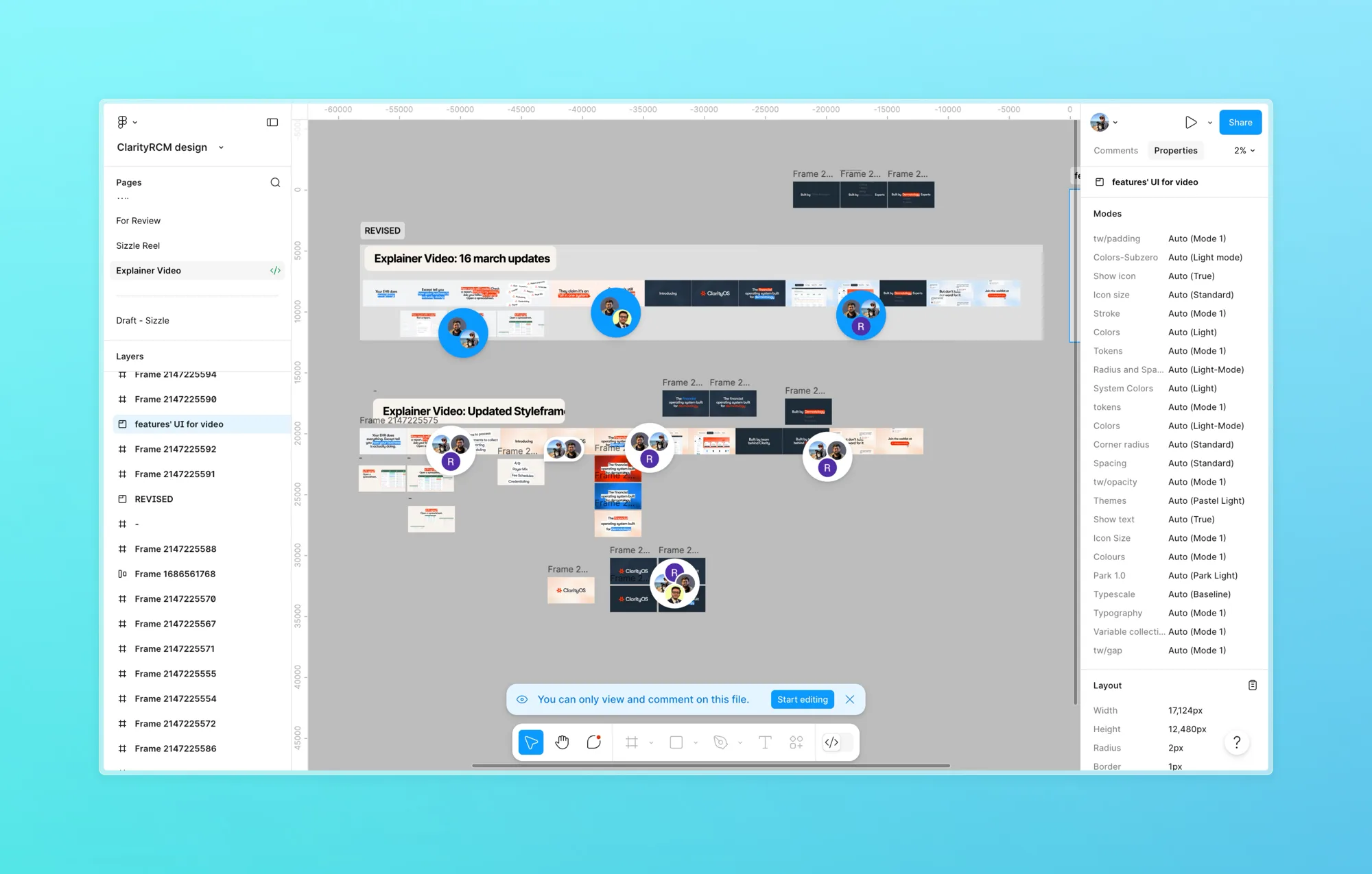
The storyboard file mid-review: revision rows, frame-by-frame notes, everyone in it at once.
The UI in every frame is real product, pulled from the product prototype our designer built. We worked through the persona views side by side, deciding together how each one should read on screen, and her constraint shaped the look more than anything else: the glass aesthetic had to hold consistent across the clinical, front-desk, and billing role views, or the product would read as three tools instead of one. The video honored it. Whichever persona you're watching, it still feels like a single system.
Direction lives in the decisions you make as the work comes together, and a couple are worth calling out. An early storyboard had a reassurance frame, "we work with your EMR." I killed it. The video's whole argument is that the current setup can't answer the basic question about your own business, and saying we layer on top of that setup, in the same breath, muddies the point. Same with the dialogue beats. Where there were two ways to phrase a vignette, I picked the one that kept the tension sharp and cut the other, so the studio was never animating a line that might not ship. I'd rather the argument stay clean than hedge it.
Results
Brief to live in about 26 days. Brief sent March 3, storyboard the 13th, UI locked on the 17th, first draft the 20th, live on os.clarityrcm.com the 21st. It launched timed to AAD, March 27 to 29 in Denver, anchoring the waitlist page with a HubSpot signup form. I cut a revised final and swapped it in on the 29th, two days into the conference, after watching it run live on the page. The video stayed on as the page's hero after the conference ended.